Opening a full-screen modal
Dictionary.com provides no satisfactory definition of modal as it relates to user interfaces, but semantic UI describes it as follows:
A modal displays content that temporarily blocks interactions with the main view
This sounds about right. A modal is like a popup — it's not part of your primary navigation flow — it usually has a different transition, a different way to dismiss it, and is intended to focus on one particular piece of content or interaction.
The purpose of explaining this as part of the React Navigation fundamentals is not only because this is a common use case, but also because the implementation requires knowledge of nesting navigators, which is an important part of React Navigation.
Creating a modal stack
class HomeScreen extends React.Component {
  static navigationOptions = ({ navigation }) => {
    const params = navigation.state.params || {};

    return {
      headerLeft: (
        <Button
          onPress={() => navigation.navigate('MyModal')}
          title="Info"
          color="#fff"
        />
      ),
      /* the rest of this config is unchanged */
    };
  };

  /* render function, etc */
}

class ModalScreen extends React.Component {
  render() {
    return (
      <View style={{ flex: 1, alignItems: 'center', justifyContent: 'center' }}>
        <Text style={{ fontSize: 30 }}>This is a modal!</Text>
        <Button
          onPress={() => this.props.navigation.goBack()}
          title="Dismiss"
        />
      </View>
    );
  }
}

const MainStack = StackNavigator(
  {
    Home: {
      screen: HomeScreen,
    },
    Details: {
      screen: DetailsScreen,
    },
  },
  {
    /* Same configuration as before */
  }
);

const RootStack = StackNavigator(
  {
    Main: {
      screen: MainStack,
    },
    MyModal: {
      screen: ModalScreen,
    },
  },
  {
    mode: 'modal',
    headerMode: 'none',
  }
);
There are some important things to notice here:
- As we know, the
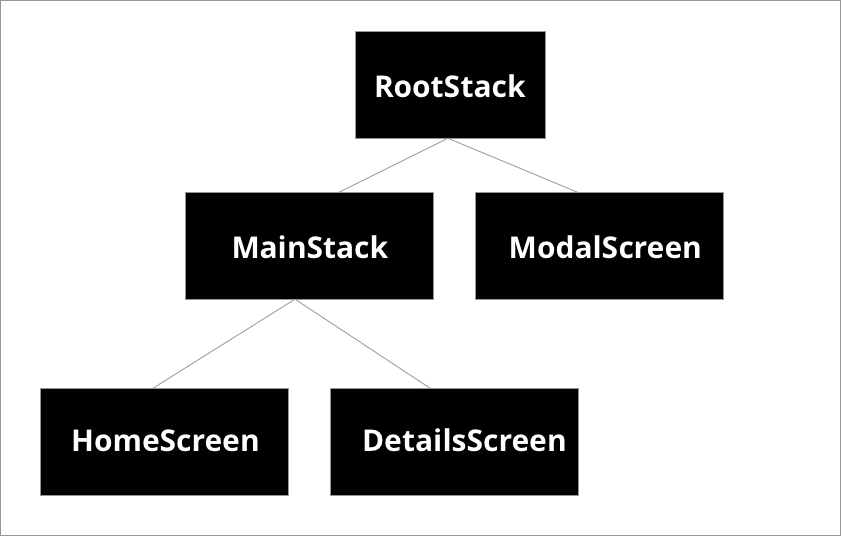
StackNavigatorfunction returns a React component (remember we render<RootStack />in ourAppcomponent). This same component can be used as a screen component! By doing this, we are nesting aStackNavigatorinside of anotherStackNavigator. In this case, this is useful for us because we want to use a different transition style for the modal, and we want to disable the header across the entire stack. In the future this will be important because for tab navigation, for example, each tab will likely have its own stack! Intuitively, this is what you expect: when you are on tab A and switch to tab B, you would like tab A to maintain its navigation state as you continue to explore tab B. Look at this diagram to visualize the structure of navigation in this example:
- The
modeconfiguration forStackNavigatorcan be eithercard(default) ormodal. Themodalbehavior slides the screen in the from the bottom on iOS and allows the user to scope down from the top to dismiss it. Themodalconfiguration has no effect on Android because full-screen modals don't have any different transition behavior on the platform. - When we call
navigatewe don't have to specify anything except the route that we'd like to navigate to. There is no need to qualify which stack it belongs to (the arbitrarily named 'root' or the 'main' stack) — React Navigation attempts to find the route on the closest navigator and then performs the action there. To visualize this, look again at the above tree diagram and imagine thenavigateaction flowing up fromHomeScreentoMainStack, we know thatMainStackcan't handle the routeMyModal, so it then flows it up toRootStack, which can handle that route and so it does.
Summary
- To change the type of transition on a
StackNavigatoryou can use themodeconfiguration. When set tomodal, all screens animate-in from bottom to top rather than right to left. This applies to that entireStackNavigator, so to use right to left transitions on other screens, we add another navigation stack with the default configuration. this.props.navigation.navigatetraverses up the navigator tree to find a navigator that can handle thenavigateaction.- Full source of what we have built so far