The documentation is now live at reactnavigation.org, and v5 lives here.
React Navigation 6 keeps mostly the same core API as React Navigation 5, and you can think of it as further polishing what was in React Navigation 5. Let's talk about the highlights of this release in this blog post.
Highlights
More flexible navigators
Navigators accept many of their customization options as props, which means we can’t customize them based on the active screen. To make this level of control possible, we needed to move these props to options that you can configure per screen.
In React Navigation 6, many of these props are now screen options. The most significant changes are tabBarOptions and drawerContentOptions, which now all live on options instead. For example:
// Before (v5)
<Tab.Navigator
  tabBarOptions={{
    inactiveTintColor: 'rgba(255, 255, 255, 0.5)',
    activeTintColor: '#fff',
    style: {
      position: 'absolute',
      borderTopColor: 'rgba(0, 0, 0, .2)',
    },
  }}
>
// After (v6)
<Tab.Navigator
  screenOptions={{
    tabBarInactiveTintColor: 'rgba(255, 255, 255, 0.5)',
    tabBarActiveTintColor: '#fff',
    tabBarStyle: {
      position: 'absolute',
      borderTopColor: 'rgba(0, 0, 0, .2)',
    },
  }}
>
See deprecations for more details.
Elements library
We extracted some of the components and helpers used across various navigators in React Navigation and published them under a new package called @react-navigation/elements. It can be useful if you're building your own navigator, or just want to reuse some of the components in your app.
Currently only a small set of components are exported, but there are more to come.
Simplified APIs for existing functionality
We simplified many APIs with React Navigation 6 to address common use cases. For example:
- Single option to use a modal presentation style and transparent modal with
presentation - Custom header doesn't require setting
headerMode="screen"manually anymore - The
useHeaderHeighthook now ignores hidden headers and returns the height of the closest visible header in parent - New option to set a custom background (such as
BlurView) for tab bar without having to use a custom tab bar - New API to manage ref on the container (
createNavigationContainerRefanduseNavigationContainerRef)
New Group component for organization
The Group component helps you organize screens inside your navigators and share common screenOptions between the Groups. Passing screenOptions to a group configures all the screens inside that group to use these options. You can override Group options by passing options to each Screen component, similar to how you can with screenOptions on Navigator. You can also nest Group components inside other Group components. They are lightweight and don’t render anything - like fragments, so they won’t affect performance.
In this code snippet, you can see that we group regular screens under one group and modal screens under another group:
function App() {
  return (
    <Stack.Navigator>
      <Stack.Group>
        <Stack.Screen name="Home" component={HomeScreen} />
        <Stack.Screen name="Details" component={DetailsScreen} />
      </Stack.Group>
      <Stack.Group screenOptions={{ presentation: 'modal' }}>
        <Stack.Screen
          name="CreatePost"
          component={CreatePostScreen}
        />
      </Stack.Group>
    </Stack.Navigator>
  );
}
Headers by default in Bottom Tabs & Drawer
Developers often want to show a header for screens inside of drawers and bottom tabs. To do this, we had to nest a stack navigator which provides a header, even if it was a navigator with just one screen. So we now show headers by default in screens of drawer and bottom tabs. No nesting necessary.
We also export a Header component in the new elements library to use anywhere in your components.
Native navigation by default
Historically, React Navigation has been mostly JS based, with animations and gestures written in JavaScript on top of react-native-gesture-handler, and react-native-reanimated or Animated. While this works for a lot of apps, apps with heavy screens can suffer from poor performance, and some native features are difficult to re-create exactly (such as the large header on iOS). So, we wanted to address this by using native primitives for navigation.
With React Navigation 5, we introduced @react-navigation/native-stack package powered by react-native-screens, as well as a native backend for @react-navigation/material-top-tabs powered by react-native-pager-view.
In React Navigation 6, we made @react-navigation/native-stack the default choice for setting up Stack navigation. It uses UINavigationController on iOS and Fragments on Android to implement navigation natively. We also focused a lot on aligning the API of @react-navigation/native-stack with @react-navigation/stack so that it’ll be easier to switch between them.
While
@react-navigation/native-stackis now used as the default choice in the documentation, it doesn't replace@react-navigation/stack. Both packages are maintained and are valid options for your projects. If you're currently using@react-navigation/stack, you can keep using it. You don't need to move to@react-navigation/native-stackunless you really want to.
Similarly, we switched @react-navigation/material-top-tabs to use react-native-pager-view by default.
Better type-safety
React Navigation 5’s TypeScript support was much better than React Navigation 4; but, some things such as useNavigation were still untyped by default.
In React Navigation 6, you don’t need to annotate useNavigation to get autocompletion and type checking. This is possible by defining a type for the screens globally using declaration merging:
declare global {
  namespace ReactNavigation {
    interface RootParamList {
      Home: undefined;
      Profile: { userId: string };
      NotFound: undefined;
    }
  }
}
You can read more about it in our TypeScript docs.
Flipper plugin
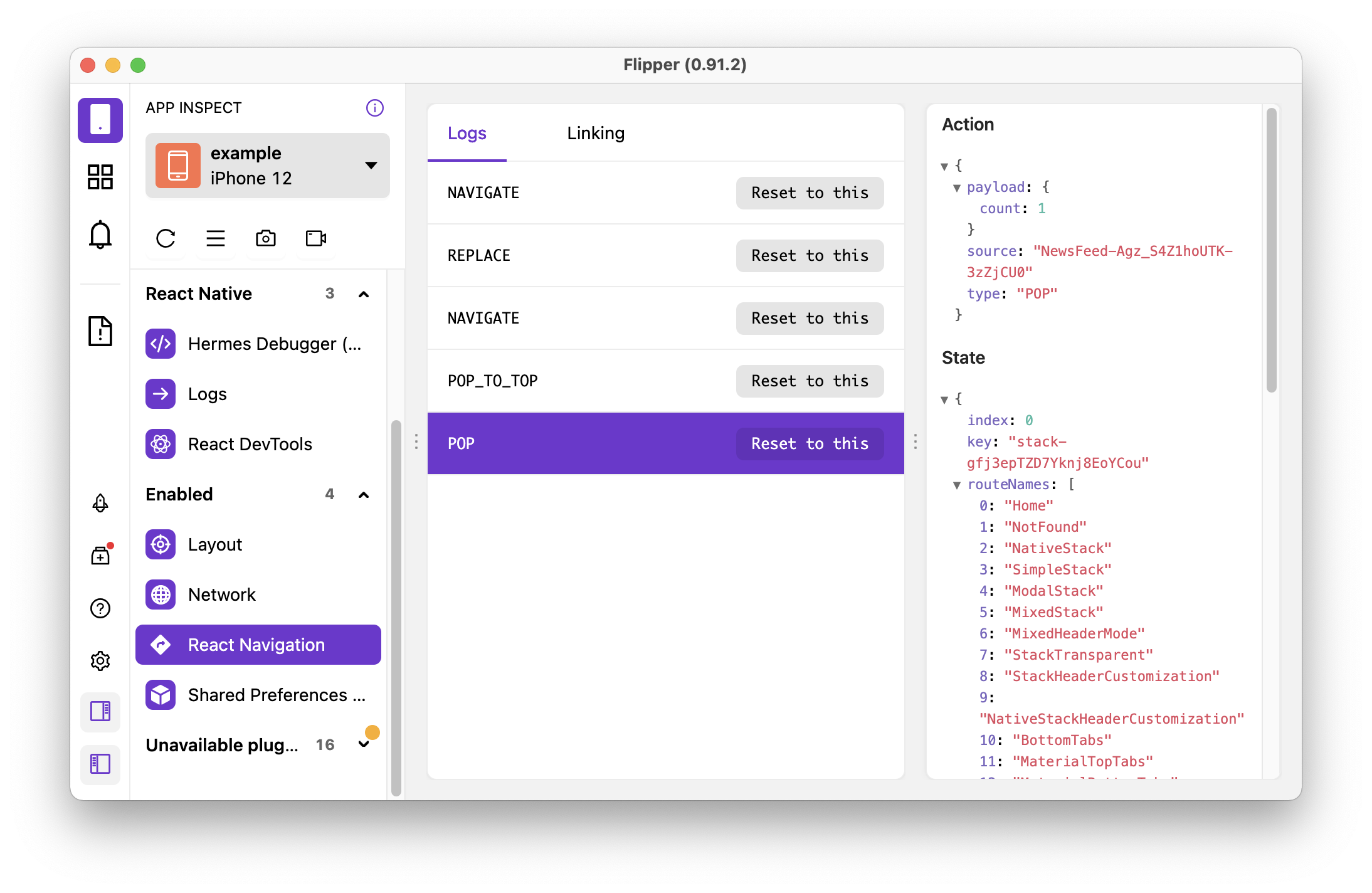
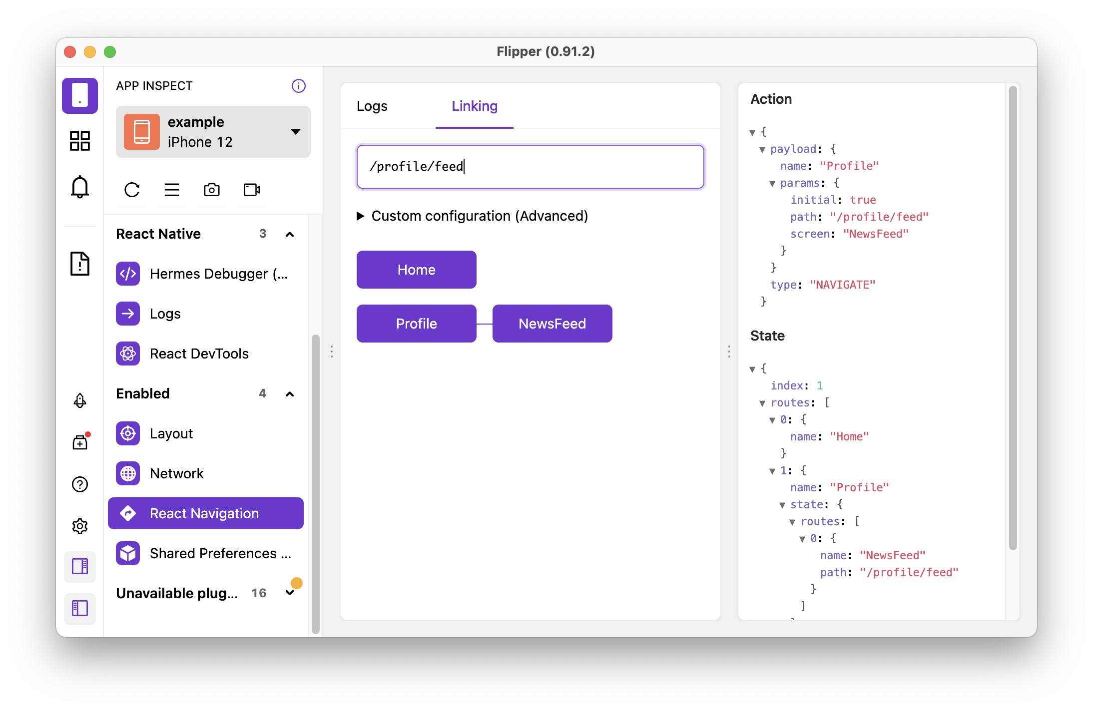
Our new Flipper plugin includes similar functionality to the currently available Redux Devtools Extensions integration. You can see all navigation actions, and jump back and forth between earlier and new navigation states. In addition, it also includes a tab to test your linking configuration.
Since the dev tools is built from scratch, we’re now free to add new features to make debugging easier in future.
One advantage of the Flipper plugin over Redux Devtools Extension is that it doesn’t need Chrome Debugger to work. Since Chrome Debugger can sometimes affect performance and even potentially change behavior, we think this is a more reliable solution.


See the guide for setting it up for more details. Note that Flipper support in Expo managed apps requires a Custom Development Client and it does not work in Expo Go at the time of writing.
Upgrading
While React Navigation 6 doesn't introduce changes of the same magnitude as React Navigation 5, there are still some breaking changes. It is possible, however, to mix packages from React Navigation 5 and React Navigation 6 (with a few caveats) so that you can gradually upgrade packages.
See the upgrade guide for a full list of changes and more details.
Sponsor us
If React Navigation helps you to deliver value to your customers, it'd awesome a lot if you could sponsor us. Sponsorships will help us to move more quickly towards our goal of building the best cross-platform navigation library and continue to provide timely support for bug reports in our GitHub issues.